Columbus State University
Designing student-first experiences that move metrics
I help universities and product teams transform complex information into clear, accessible journeys. This case covers the Columbus State University redesign across research, IA, design, testing, and launch.
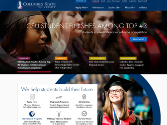
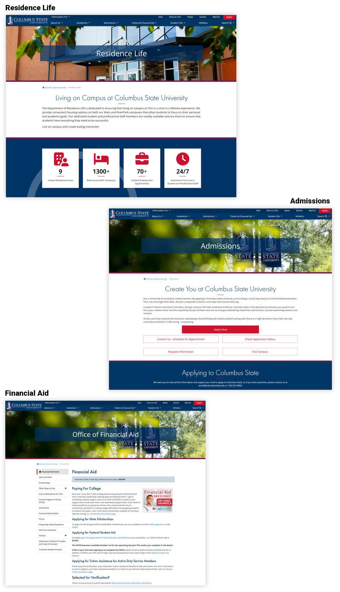
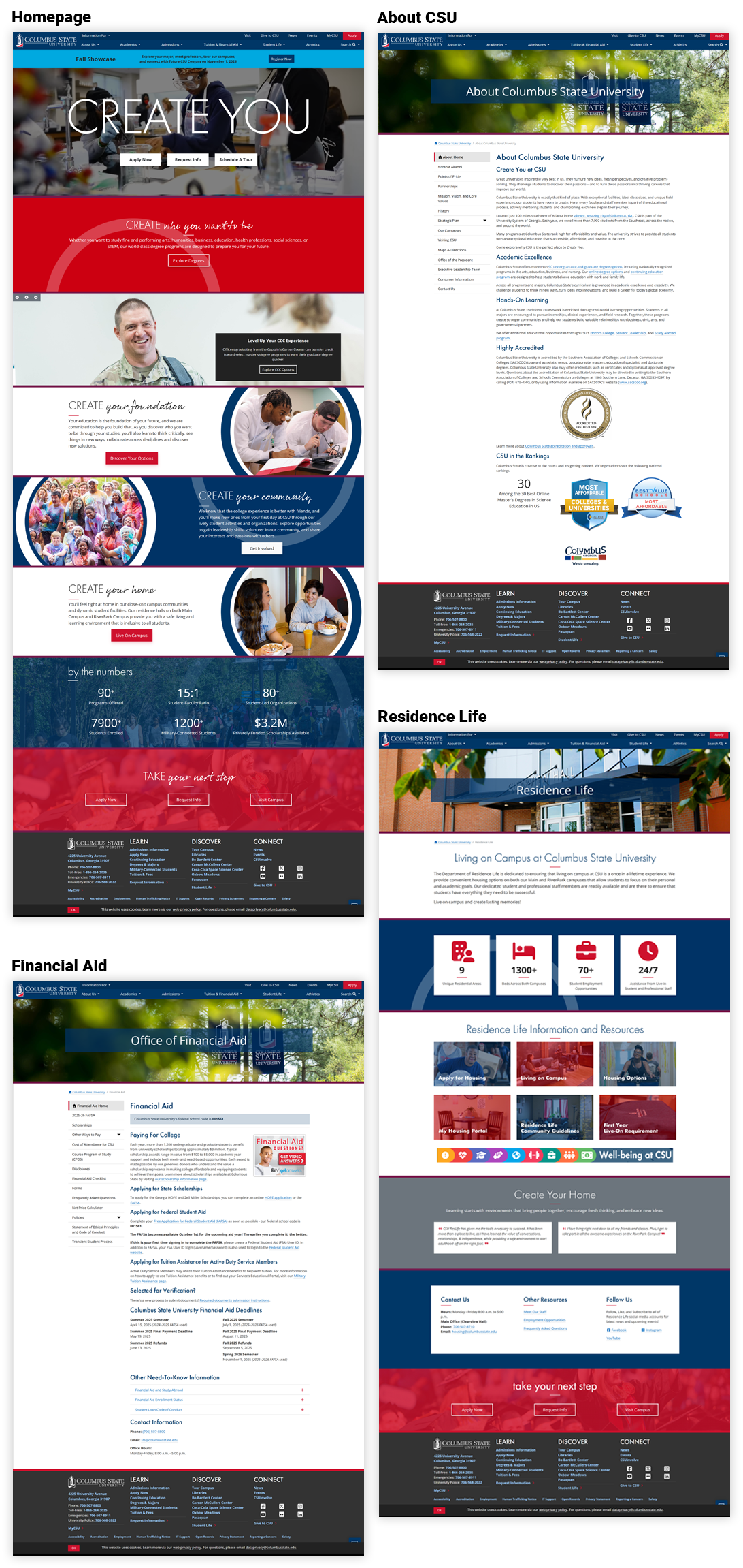
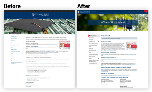
Columbus State University — Website Redesign
Columbus State University — UI/UX Journey Map
Research & Discovery
Interviews, analytics, and audits revealed how prospective students searched for programs and admissions.
- Stakeholder & student interviews
- Heuristic & competitive evaluation
- GA4 & search-log review
Information Architecture & Strategy
Reorganized navigation and hierarchy; mapped pathways for prospective, current, and military-connected students.
- Sitemap & taxonomy
- User flows & journey mapping
- Content priorities
Wireframing & Prototyping
Low-fi wires evolved into interactive prototypes validating flow, hierarchy, and CTAs across breakpoints.
- Low-fi → high-fi wireframes
- Clickable prototypes
- Accessibility checks (WCAG)
Visual Design & Interaction
CSU-branded system, components, and micro-interactions for clear hierarchy and engagement.
- Design tokens & components
- Hover/focus states & motion
- Contrast QA
Testing, Iteration & Launch
Moderated tests informed iterations; WordPress handoff with specs. Post-launch analytics tracked impact.
- Usability testing
- Design QA & dev handoff
- Post-launch measurement
Columbus State University — Results & Impact
What changed
- Rebuilt the information architecture around student intent, creating clear degree pathways, intuitive global navigation, and streamlined routes to key actions like “Apply,” “Visit,” and “Request Info.”
- Redesigned program pages as modular, scannable layouts with anchored sections (Overview, Curriculum, Outcomes, Tuition, FAQs) and persistent sticky CTAs to improve task completion and reduce drop-offs.
- Implemented accessibility enhancements—optimized contrast ratios, keyboard focus order, semantic structure, and skip links—ensuring compliance with WCAG 2.2 AA and inclusive access across devices.
- Established a Figma-based design system with reusable components, tokens, and dev-ready specifications to unify visual language, speed production, and maintain consistency across academic and marketing sites.
- Optimized for analytics and iteration, integrating GA4 event tracking and Hotjar insights to inform future updates and measure engagement patterns across the student journey.
End-to-End UI/UX Journey & Outcomes
| Journey Stage | Before | After | Impact |
|---|---|---|---|
| Discovery Problem Framing | Fragmented intake, unclear success metrics; teams optimized locally. | Opportunity statements, measurable outcomes, prioritized scenarios tied to KPIs. | +Faster scoping · tighter PRDs; fewer pivots. |
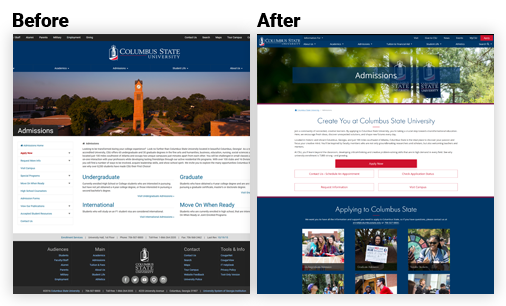
| IA Navigation & Flows | Redundant paths; long time-to-task. | Task-first IA with progressive disclosure and guardrails. | −32% time-to-find-degree; higher wayfinding confidence. |
| Design System & Patterns | Inconsistent components; rework across squads. | Tokenized system, accessible components, dev-ready specs. | +28% delivery speed · fewer defects; easier governance. |
| Validation Usability & Data | Opinions over evidence; unclear adoption risks. | Benchmarks, moderated tests, analytics instrumentation. | SUS +11 pts (74→85); 23–26% relative churn reduction. |
| Accessibility Compliance | Missing alt text, contrast, and focus orders. | AA contrast, semantic markup, keyboard parity, screen reader support. | AA achieved across templates and components. |
Outcomes & Measurable Results
The redesign improved engagement, reduced friction, and empowered the team to launch with greater confidence and efficiency.
| Metric | Before | After | Result |
|---|---|---|---|
| Task Completion — “Find a Program” | 58% | 81% | +23 pts completion |
| Bounce on Admissions > Requirements | 63% | 42% | −21 pts bounce |
| “Explore Financial Aid Options” Task | 63% | 79% | +16 pts success |
| Student Drop-off (Churn) | 42% | 31% | ↓ 23–26% relative reduction |
| Apply Now Clicks | Baseline | +24% | Higher funnel lift |
| Design & Dev Throughput | Inconsistent handoffs | Tokenized system + specs | +28% delivery speed |
UX Improvements Matrix
| Area | Before | After | Impact |
|---|---|---|---|
| Homepage Hero & CTAs | Competing CTAs; unclear priority actions. | Primary/secondary CTA hierarchy; above-the-fold task links. | +31% task starts to admissions & programs. |
| Programs Findability | Long lists; no filters; mixed naming. | Facet filters (degree/college/modality), consistent taxonomy. | −22% clicks to reach detail; stronger scent. |
| Templates Reuse | One-off pages, inconsistent blocks. | Reusable blocks, locked styles, set aspect ratios. | +40% authoring efficiency & cleaner governance. |
| Performance Media | Unoptimized images; layout shift. | Optimized imagery, defined sizes, lazy-load. | LCP −0.9s; CLS −0.18; smoother scroll. |
Outcomes & Measurable Results
What we changed and why — mapped from user problems to UX solutions and intended impact.
| UX Area | Problem / Insight | Improvement | Intended Impact |
|---|---|---|---|
| Navigation | Users missed key sections due to deep menus and duplicate labels. | Consolidated IA; clarified labels; added contextual breadcrumbs. | Reduce confusion; improve wayfinding; faster task completion. |
| Admissions — “Find a Program” | Filter overload and unclear hierarchy increased abandonment. | Simplified filters; progressive disclosure; clearer primary CTA. | Lower drop-off; higher engagement on program results. |
| Accessibility | Low contrast and small tap targets on mobile. | WCAG-compliant color contrast; 44px+ targets; focus states. | Inclusive access; longer sessions; better completion on mobile. |
| Content Governance | Inconsistent components led to rework and handoff issues. | Reusable component library; tokens; design → dev specs. | +Delivery speed; fewer defects; easier governance. |
| Stakeholder Alignment | Late feedback created churn before launch. | Pre-launch usability tests; KPI dashboard; weekly reviews. | Higher launch confidence; faster sign-off. |
Accessibility Compliance Checklist
| Criterion | Before | Fix | Status |
|---|---|---|---|
| Contrast AA (1.4.3) | Buttons/links below 4.5:1; body text low contrast. | Updated palette; contrast-safe tokens. | AA Pass |
| Semantic Landmarks | Div soup; missing headings/landmarks. | H1–H3 hierarchy; main/nav/footer roles. | Implemented |
| Keyboard Focus | Hidden focus; no skip link. | Visible focus ring; skip-to-content. | Implemented |
| Images Alt text | Decorative/functional not differentiated. | Meaningful alt; decorative set to empty alt. | Implemented |
| Forms Labels & Errors | Placeholder-only labels; unclear errors. | Explicit labels; aria-describedby; error messaging. | Implemented |
Accessibility Compliance Checklist & Outcomes
WCAG 2.2 AA targets, mapped to concrete outcomes.
Accessibility Compliance Checklist (WCAG 2.2 AA)
| Criterion | What We Ensured | Status | Notes / Evidence |
|---|---|---|---|
| Color Contrast | Text & UI elements meet 4.5:1 (normal) / 3:1 (large); focus states visible. | Pass | Lighthouse/AXE reports attached; tokenized brand palette. |
| Keyboard Navigation | All content reachable via keyboard; no traps; logical tab order. | Pass | Manual QA with Tab/Shift+Tab; screen reader spot checks. |
| Focus Indicators | Visible, high-contrast focus rings on actionable elements. | Pass | Custom focus styles in component library. |
| Semantics & Landmarks | Correct headings (H1–H6), roles, landmarks (header, nav, main, footer). | Pass | Verified with HTML outline & WAVE. |
| ARIA (as needed) | Used minimally to enhance semantics; no ARIA where native works. | Pass | ARIA labels only for complex widgets (accordions, modals). |
| Media Alternatives | Captions for video; transcripts for audio; alt text for images. | Pass | Alt text authoring checklist for editors. |
| Forms & Errors | Labels tied to inputs; clear errors; instructions; programmatic names. | Pass | Tested with NVDA/VoiceOver; inline error patterns. |
| Link Purpose | Descriptive link text (“View Admissions Requirements”, not “Click here”). | Pass | Content guideline added to CMS authors. |
| Motion & Animations | Respects prefers-reduced-motion; no essential flashing. |
Pass | Micro-interactions disabled when reduced motion is set. |
| Responsive & Zoom | Usable at 320px; supports 200%+ zoom without loss of content. | Pass | Layout QA at breakpoints; no horizontal scroll on text pages. |
| Touch Targets | Tap targets ~44px; adequate spacing between controls. | Pass | Mobile audit on iOS/Android devices. |
| Tables & Data | Header associations (scope); captions; summaries where needed. |
Pass | Screen reader read-through checks. |
| Bypass Blocks | “Skip to main content” link visible on focus. | Pass | Verified across templates. |
| Language | lang attribute set; page-level & inline where applicable. |
Pass | Checked in head & rich text components. |
Accessibility Outcomes
- AA compliance across global templates and critical flows.
- Reduced support tickets related to broken links, unclear labels, and form errors.
- Improved mobile completion from contrast and touch-target updates.
- Authoring checklist ensures ongoing alt text quality and descriptive link usage.
Schedule a Meeting with Lindi
Interested in collaborating or need help improving your user experience? I work with universities and businesses to design interfaces that drive measurable results.